K12 Story Studio
Role: UX/UI Designer at Stride, working across product and design on K12 Story Studio. I made the calls on three core surfaces (the student quiz, the parent dashboard, and the book reader), owned the content and interaction decisions, ran the research behind them, and partnered with the PM on scope and roadmap. Company: Stride. Timeline: 2024.
K12 Story Studio is an AI storytelling product that lets K-4 students create and read stories while building literacy through quizzes and an interactive reader. The technology was ambitious, but the everyday experience got in its own way: kids stalled inside quizzes, parents couldn’t tell whether reading was actually improving, and the reader was a chore to move through. The question wasn’t “add more.” It was “why isn’t the learning loop landing?”
So I made a deliberate bet: fix the core loop (read, quiz, see progress) before anything else, and treat the quiz, dashboard, and reader as one connected system, not three separate screens. Every change had to earn its place against comprehension and engagement, not polish. I worked inside Stride’s Unified Design System on purpose, so the work would ship on existing components and scale across the product instead of forking it.
Outcome
A tighter learning loop connecting the reader, quiz, and parent dashboard, so progress read as one story instead of three disconnected screens.
Clearer quiz feedback and navigation that gave K-4 students a way to learn from a wrong answer instead of stalling on it.
A roughly 20% shorter feature delivery cycle, from tighter backlog and sprint planning I ran in JIRA.
Research that opened up a new teacher-facing dashboard, extending the product to a second core user.
Shipped inside Stride’s design system, into a platform used by more than 10,000 educators.
The problem
Story Studio could generate a story, quiz a student on it, and report progress to a parent. On paper the learning loop was complete. In practice every step leaked, and I kept hitting the same three failures, each one quietly costing the product the engagement it was built for.
On paper the read, quiz, and progress loop was complete; in practice every step leaked.
In the quiz, students stalled instead of learned
A wrong answer gave no useful guidance, so a student hit a dead end instead of a second try.
Moving between questions wasn’t obvious, which turned basic navigation into friction for a K-4 user.
The flow had little to pull kids forward, so a quiz felt like a test rather than part of the story.
For parents, progress was noise, not signal
Parents couldn’t easily tell whether their child was actually improving.
Story completion, quiz results, and literacy gains lived apart, so nothing added up to a picture.
Too much on screen at once buried the few things a parent actually cared about.
In the reader, the story got in its own way
Clumsy page-to-page navigation was enough to break a young reader’s immersion.
No font-size or contrast options meant the reader failed the kids who needed them most.
Thin audio and visual support left the reading experience flatter than it should have been.
How I worked
This was a blended role, and I treated it that way. I owned the product and design decisions on my surfaces and kept a cross-functional team pointed at the same outcome:
Product & strategy. Partnered with the PM to align each feature against strategic goals and real user needs, and ran backlog and sprint planning in JIRA to keep delivery moving.
Research. Worked with researchers and content strategists, using usability testing to settle decisions with evidence instead of opinion.
Engineering. Worked with front-end and back-end engineers to keep scope honest against what we could build and ship accessibly.
Stakeholders. Presented biweekly to executives, administrators, and educators to keep business goals and classroom reality in sync.
1. Framing the problem
Before changing anything, I wanted the brief to be measurable. I audited the existing quiz questions, dashboard, and reader for where they broke down, and benchmarked comparable learning products to see what the category had already taught students and parents to expect. That turned a broad “improve engagement” goal into a short list of problems I could design and measure against.
I audited the quiz, dashboard, and reader and benchmarked comparable products to turn a broad engagement goal into problems I could measure.
2. The quiz: a learning loop, not a test
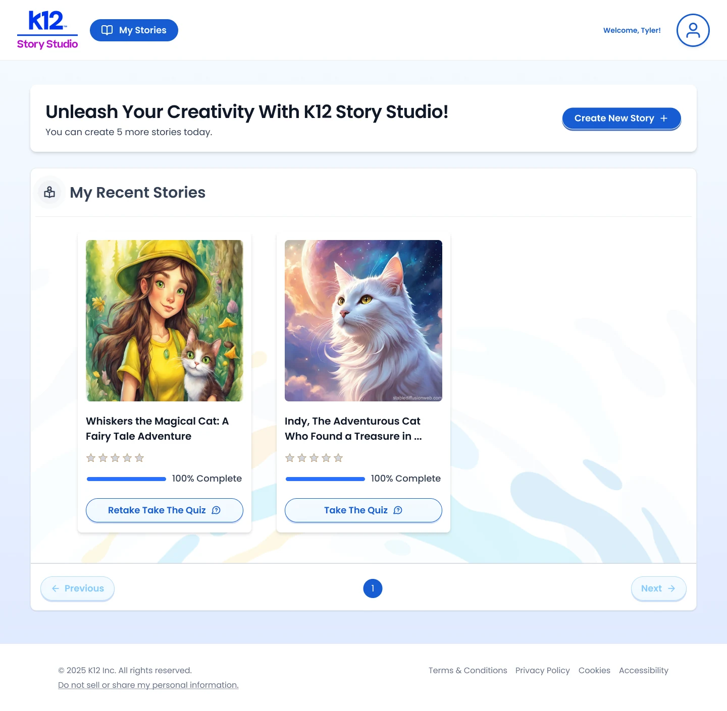
The most important call here was to treat the quiz as part of learning, not a graded checkpoint. For a seven-year-old, a wrong answer with no path forward is exactly where engagement dies, so I put feedback at the center of the design: an incorrect answer now nudges the student toward understanding instead of just marking them wrong. I sequenced questions into a clearer, guided path and added progress cues so kids always knew how much they had left.
Because the users are five to ten years old, the words carried as much weight as the flow. I rewrote prompts, error messages, and success feedback to be developmentally appropriate and encouraging, and cut instructional tooltips down to what a young reader could actually follow. This is where design and content strategy did the product work: for this age group, the copy is the interface.
I put feedback at the center so a wrong answer nudges a student toward understanding instead of dead-ending them.
For this age group the copy is the interface, so I rewrote prompts, error messages, and success feedback to be developmentally appropriate.
3. The dashboard: progress that means something
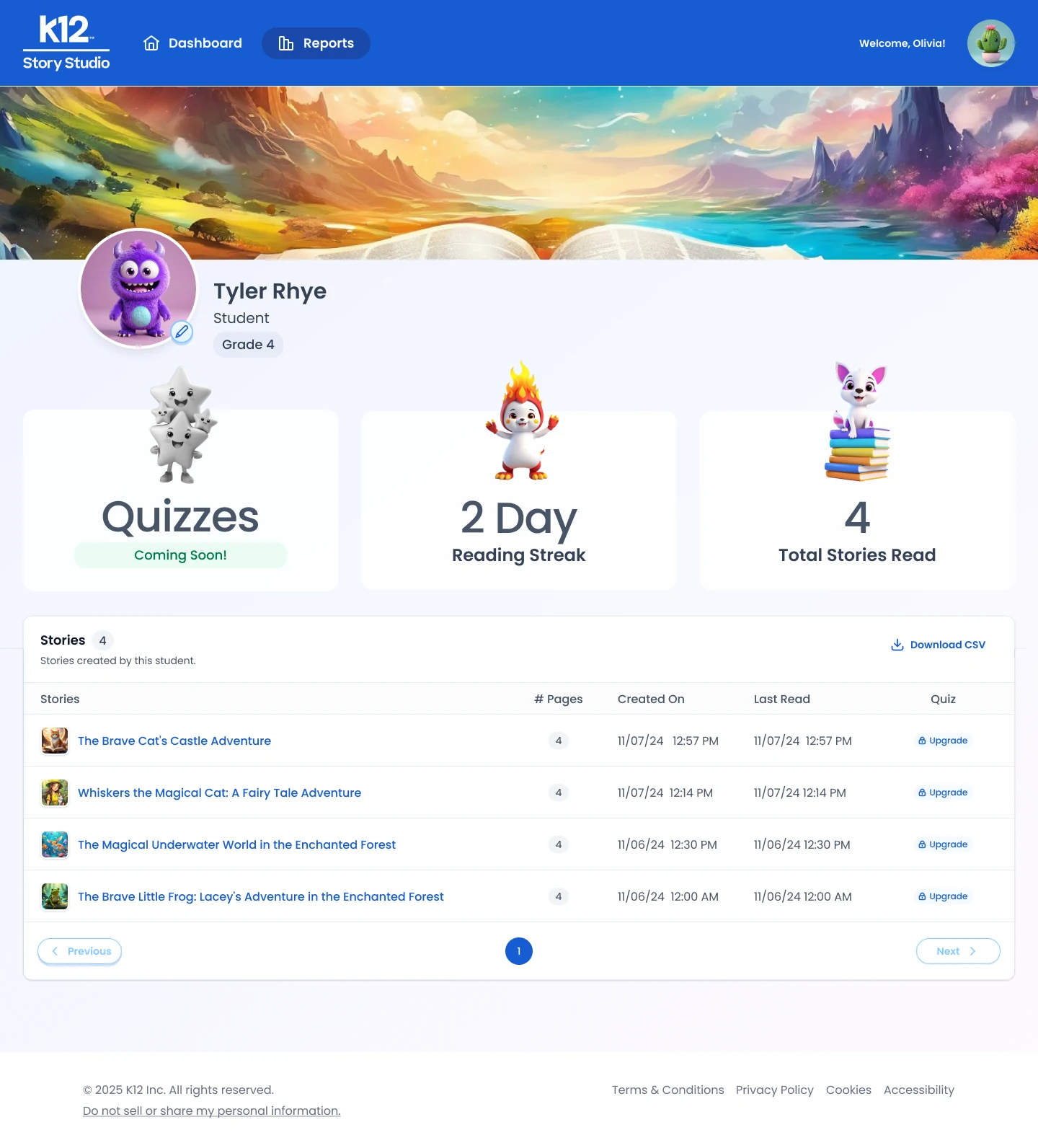
Parents didn’t need more data, they needed a verdict: is my kid improving? So I connected quiz results to overall performance and rebuilt the dashboard around that one question, pulling the signal to the top and pushing detail beneath it. Tying those numbers together on the shared design system also meant the same progress model could carry into other parts of the product instead of living as a one-off screen.
Parents needed a verdict, not more data, so I rebuilt the dashboard around one question: is my kid improving?
4. The reader: out of the way of the story
The reader has one job, keep a kid inside the story, so every decision aimed at removing friction and widening who could use it. I gave it clear page navigation, added font-size and dark-mode controls so the experience worked for more kids rather than an average one, and strengthened audio so the story could carry students still building fluency. Accessibility here wasn’t a compliance box to tick; it directly expanded the product’s reachable audience.
The reader’s one job is keeping a kid inside the story, so clearer page controls, font and contrast options, and stronger audio widened who could use it.
Try it yourself
The result
The payoff was a learning loop that finally held together. Clearer quiz feedback gave students a way to recover from a wrong answer, the reader stayed out of the way of the story, and the dashboard pulled reading, quizzes, and progress into one view a parent could actually read. Because it all shipped on Stride’s Unified Design System, the improvements stayed consistent across the product rather than living in one corner of it.
The loop finally held together: quiz feedback, reader, and dashboard worked as one and stayed consistent across the product.
Finding the next product: the teacher dashboard
The clearest opportunity I found wasn’t a fix, it was a whole user we were underserving. Teachers were managing student progress inside a dashboard built for parents, so I led new research into how they actually track reading engagement and run a classroom day to day.
What I heard pointed to a distinct product, not a tweak:
Teachers need a dashboard built for the classroom, not a parent view with more rows.
Customizable reporting is essential for assessing performance across a whole class efficiently.
Better navigation and data visualization would make the tool something teachers reach for, not around.
That work defined the case for a dedicated educator experience and set up the next phase of the product.
Impact
The work shipped into a platform used by more than 10,000 educators, the scale I was designing within.
I cut the feature delivery cycle by roughly 20% through tighter backlog management and sprint planning in JIRA.
Iterative usability testing brought down task-completion errors in the high-volume classroom tools.
The lesson I took into product work: for a learning tool, the win is closing the loop, not adding to it. Make the feedback land, make progress legible, and get the interface out of the way, and the product does the one thing it was built to do.