Keurig Smart Brewers
Role: UX/UI Designer (contract) on the smart-brewer experience, spanning the companion app and the on-device interface, from framing the problem to shipping. Client: Keurig Dr Pepper. Timeline: 2022.
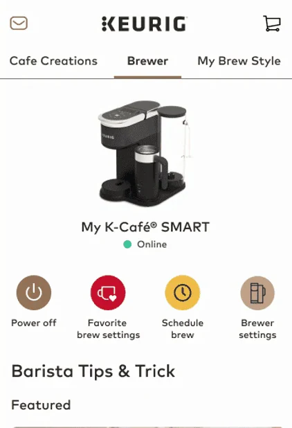
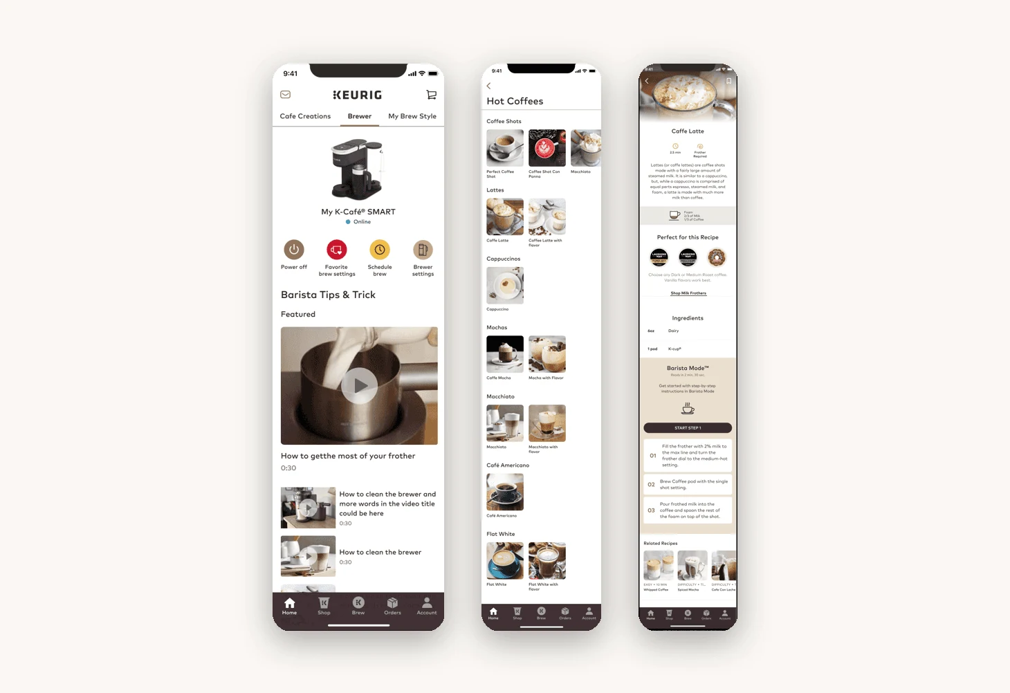
Keurig’s newest smart brewers were capable machines wrapped in an experience that hadn’t kept up. The hardware could do far more than the interface let on, so the real question was never “make it prettier.” It was “why aren’t owners using what they already paid for?” I owned that answer across two surfaces at once: the phone in your hand and the panel on the machine.
My bet was to treat the app and the brewer’s screen as one connected system, not two products, and to protect the everyday path (wake, choose, brew) ahead of feature breadth. Every interaction had to answer three questions on sight: what’s happening, what to do next, and what just changed.
Outcome
Less time on everyday brewing tasks after launch, off a shorter, clearer path.
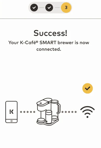
A simplified brewing flow with clear feedback at every step, so owners always know the machine’s state.
One consistent experience across the app and the device, extended cleanly to mobile.
Shipped on schedule and hit its initial satisfaction goals, with a roadmap for the next round of improvements drawn from ongoing feedback.
The problem
The experience was more complicated than the coffee it made. Controls weren’t intuitive, feedback was unclear, and simple tasks took more steps than they should. That friction landed at exactly the wrong moment, when someone just wanted a cup of coffee, and it quietly undercut the whole reason to pay for a “smart” brewer in the first place.
Research narrowed it to three recurring failures: people couldn’t tell what state the machine was in, got no clear confirmation when something worked, and had to relearn the controls almost every time. Those three became the bar the redesign had to clear.
Owners couldn’t tell what state the machine was in, got no clear confirmation when something worked, and had to relearn the controls almost every time.
How I worked
I drove the redesign across a cross-functional team, owning the calls and keeping everyone pointed at the same outcome:
Design & research. Partnered with another designer and two researchers, using usability testing to pressure-test decisions rather than defend them.
Engineering. Worked with two engineers to keep scope honest against what the hardware could actually do.
Product & marketing. Aligned with the PM on scope and roadmap, and with marketing on branding and in-app messaging.
1. Framing the real problem
I started by listening. We interviewed 15 owners to find where the experience actually broke down, and the pattern held: fewer steps, clearer feedback, controls that didn’t need a manual. I paired that with a competitive teardown of other smart brewers to see where the category had set expectations and where there was room to do better. That work turned a vague “make it better” brief into three problems we could measure against.
Owner interviews and a competitive teardown turned a vague “make it better” brief into three problems we could measure against.
2. Betting on the common path
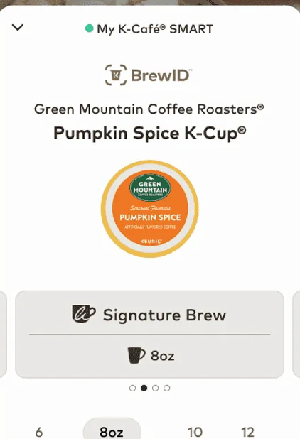
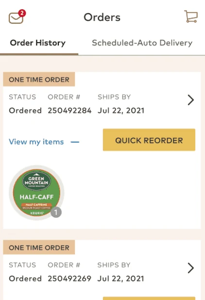
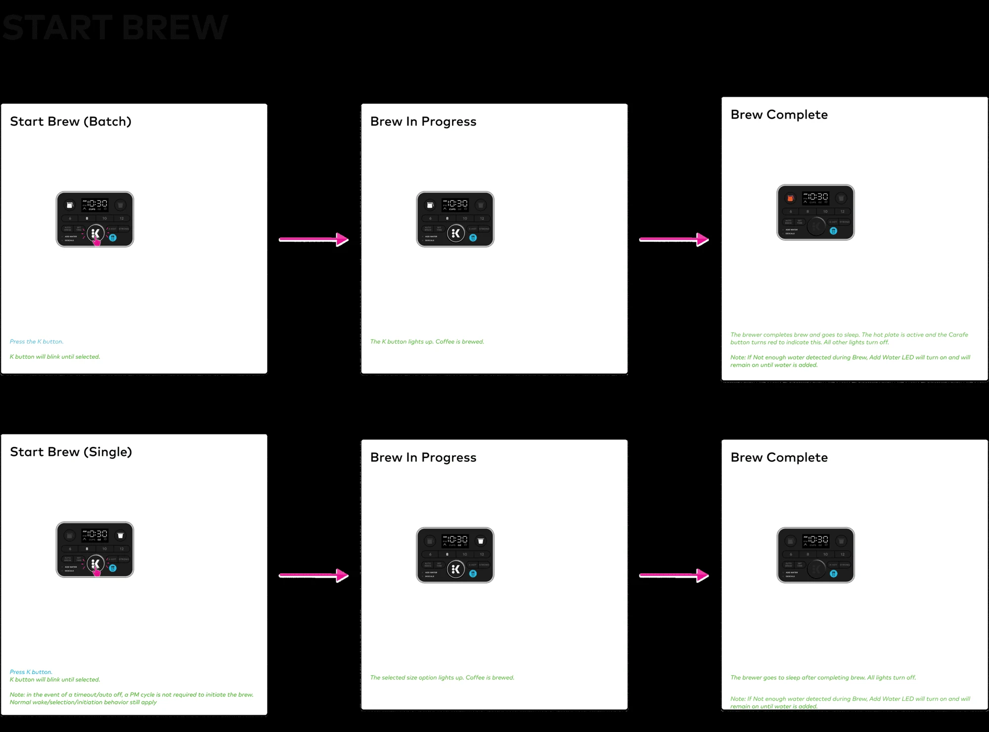
With the problems mapped, I made a deliberate scope call: win the everyday path (brew, choose a size, schedule) before anything else. Instead of adding features, we cut steps and made state and feedback impossible to miss. Keeping the flows on the existing component library was a product decision too: it let the work ship without rebuilding the system, so the win landed sooner.
I chose to win the everyday path first, cutting steps instead of adding features and staying on the existing component library so the work shipped sooner.
3. De-risking on the hardware
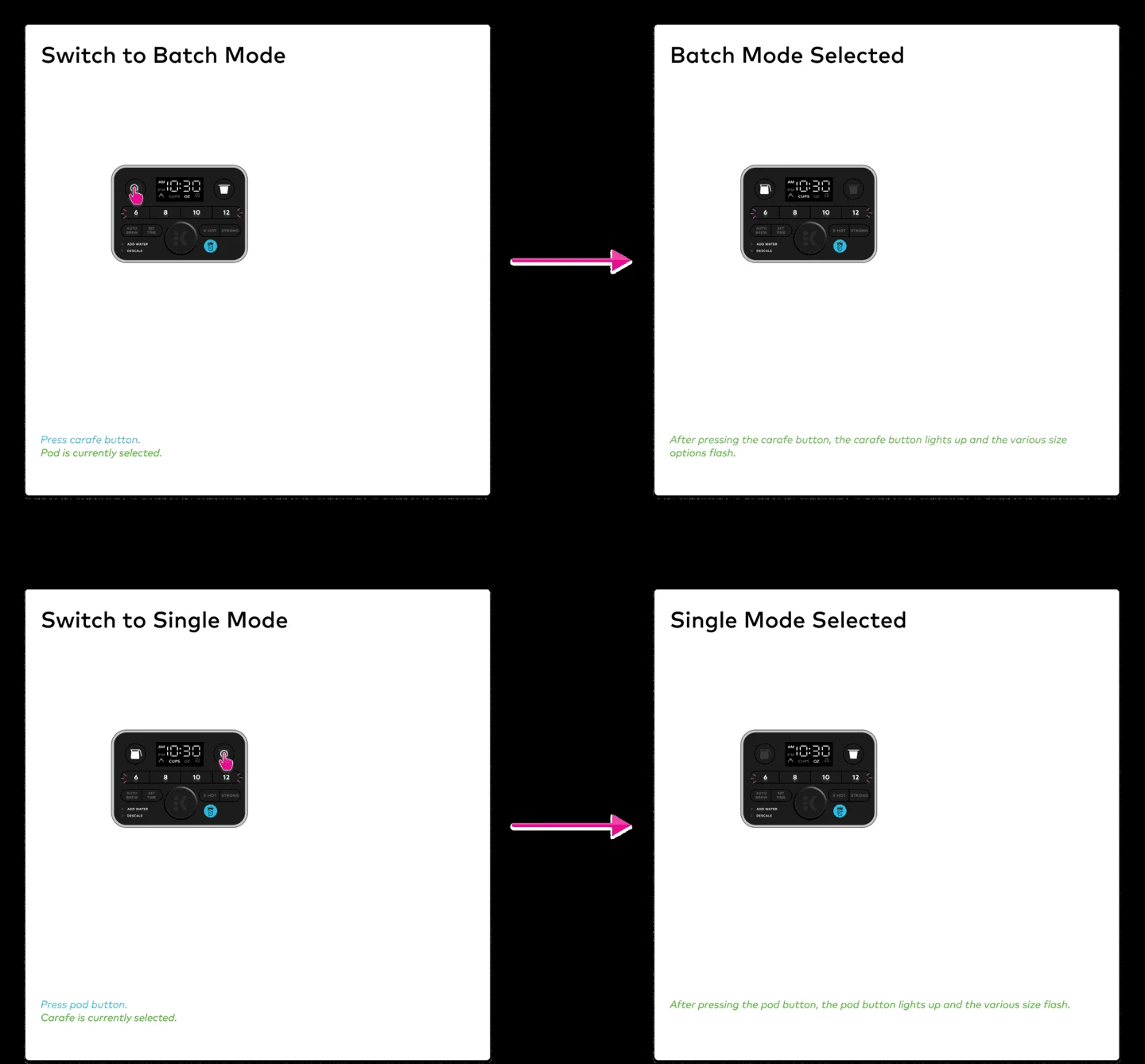
I built high-fidelity, interactive prototypes to feel the flows in motion: how the brewer wakes, how a brew progresses, how it tells you it’s done. They surfaced hardware constraints early instead of at launch. The on-device screen was the hardest tradeoff, since it has to say a lot with very little, so every light and label had to earn its place. Prototyping those states let us settle arguments with something real instead of opinions.
Interactive prototypes surfaced hardware constraints early and settled tradeoffs with something real instead of opinions.
4. One product across two surfaces
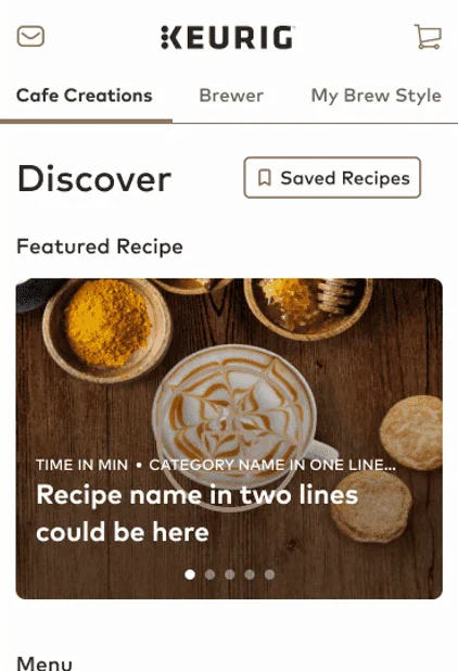
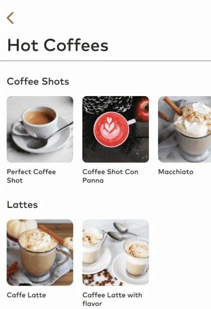
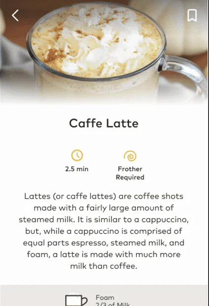
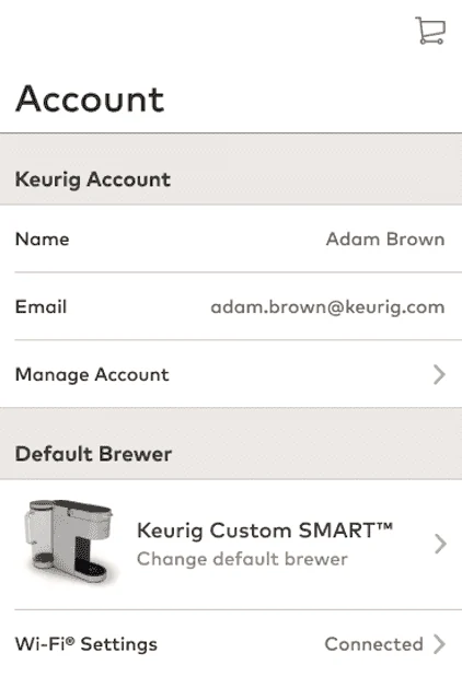
Finally I extended the experience to mobile, holding the app and the brewer to one visual language and one mental model. Moving between your phone and the machine should feel like the same product, and that was the point. The technology gets out of the way of a good cup of coffee, whichever screen you’re on.
Holding the app and the brewer to one visual language and one mental model makes moving between them feel like the same product.
Try it yourself
The result
The payoff was a brewing experience that feels obvious instead of fiddly: clear controls, honest feedback, and one consistent product from the app to the brewer itself. In testing and after launch, owners moved through brewing tasks faster and kept telling us how much easier the machine had become to use. It shipped on schedule and hit its satisfaction goals.
The lasting lesson was a product one, not a visual one. The fastest way to make a “smart” device feel smart is to remove steps and remove doubt, not to add features. Optimize the path people actually take, and the technology finally gets out of the way.
A brewing experience that feels obvious instead of fiddly, shipped on schedule and hitting its satisfaction goals.
The lasting lesson: to make a “smart” device feel smart, remove steps and remove doubt instead of adding features.