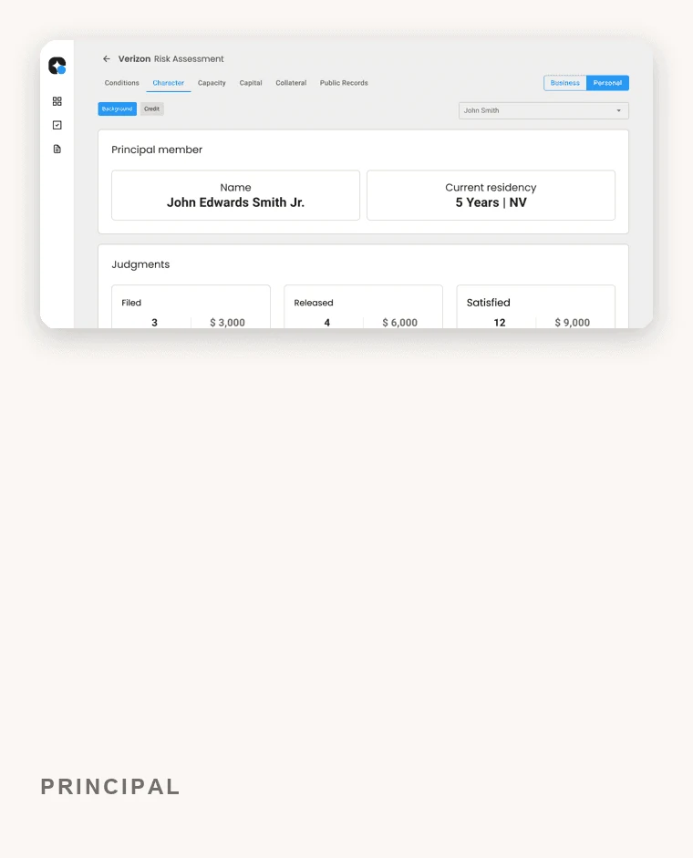
Unisyn Technologies
Role: UX/UI Designer (contract) at Unisyn, doing product and design work at once. I defined requirements, set priorities with the PM, turned cross-functional inputs into a prioritized backlog, and aligned Product, Engineering, and leadership on what to build. Leading a team of four designers was part of the job, not the whole of it. Client: Unisyn Technologies. Focus: a risk-assessment platform for commercial lending.
Lenders make high-stakes calls fast, but the information they leaned on was scattered across sources and hard to reason about. The real question wasn’t “make it look modern.” It was “why can’t a lender reach a confident decision without assembling the picture by hand?” My job was to turn a complex, high-risk process into one a lender could trust and move through quickly, without giving up any of the rigor the work demands.
My bet: focus the product on the two tasks lenders actually repeat, starting an assessment and reviewing a report, before adding anything else, and treat security as a first-class part of the experience instead of a constraint bolted on at the end.
Outcome
Cut the time lenders spent on risk-assessment tasks.
A streamlined assessment flow that made dense financial data easy to read and act on.
A security-first experience built for sensitive financial information.
Positive feedback on both the ease of use and the depth of the feature set.
The problem
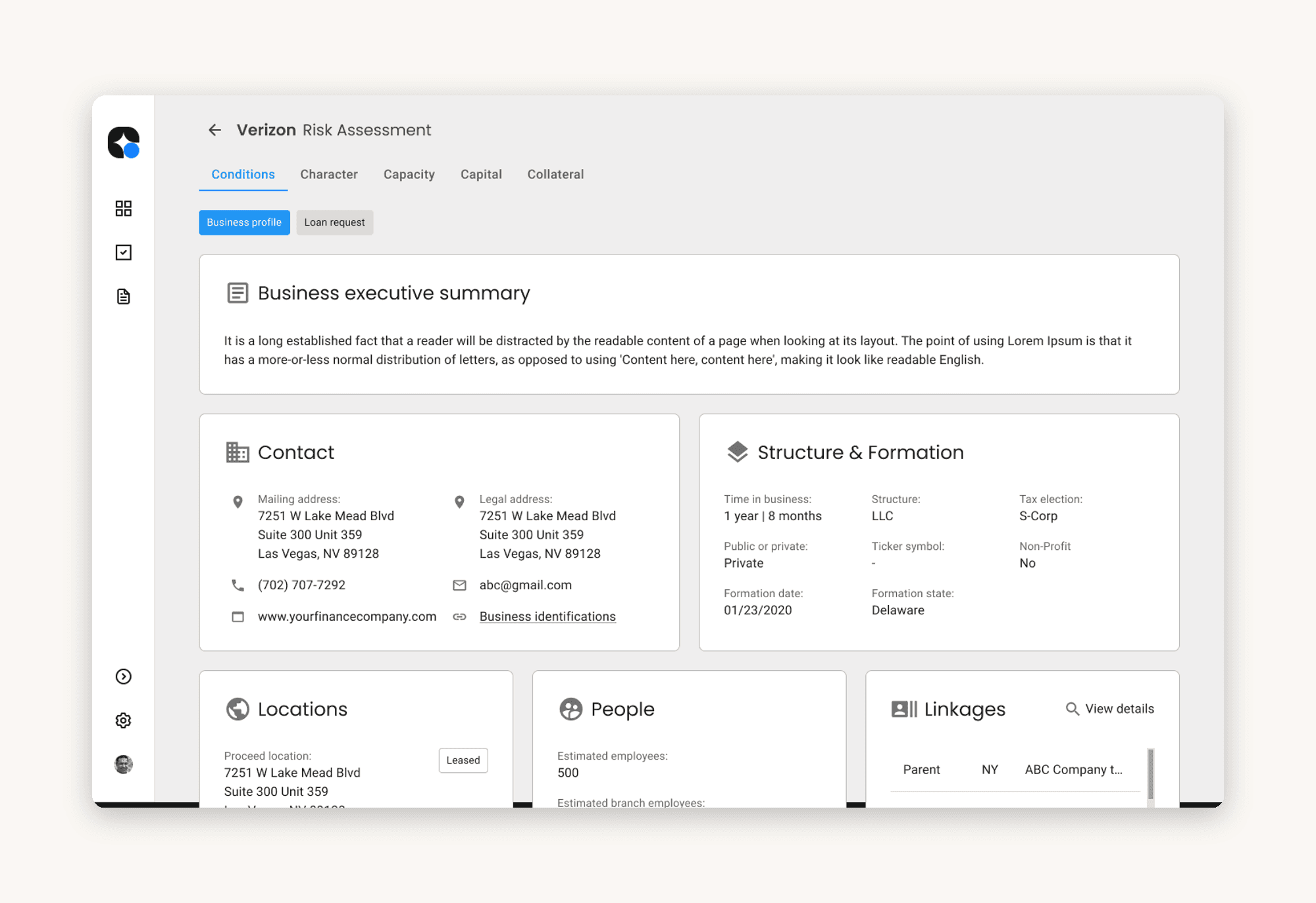
Commercial lending is high-stakes and high-complexity. Assessing a borrower means weighing dozens of factors (capacity, collateral, capital, character, conditions) across both business and personal profiles, on sensitive financial data that has to stay secure. The existing tools made that harder than it needed to be: information was dense and fragmented, and lenders had no single, confident view to decide from.
The need was clear: one secure place to run a risk assessment efficiently, without trading away rigor. That framing is what the rest of the work had to serve.
Lenders had no single, secure view to decide from, so the job was one confident place to assess risk without giving up rigor.
How I worked
I sat between the disciplines and kept everyone pointed at the same outcome, owning the calls about what to build and in what order:
Product. Partnered with the PM to define feature priorities, then turned cross-functional inputs into a prioritized backlog with acceptance criteria engineering could build against.
Engineering. Worked with front-end and back-end engineers to keep scope honest against what was feasible, joining stand-ups and reviews to unblock decisions early.
Research & data. Grounded decisions in insight from researchers and data analysts, not opinion.
Leadership. Presented recommendations directly to C-suite stakeholders and aligned on strategy.
Design. Led a team of four designers, holding the interface consistent across the product.
1. Deciding what to build first
Rather than chase feature breadth, I made an early scope call: win the two tasks lenders repeat most, starting a risk assessment and reviewing a report, before anything else. Competitive teardowns of other risk tools showed a category that was dense and hard to act on, so a clearer path through those two flows was where a better product could win. I turned a vague “build a risk platform” brief into priorities the team could measure against.
I scoped to the two tasks lenders repeat most, starting an assessment and reviewing a report, before adding anything else.
2. Making dense data decision-ready
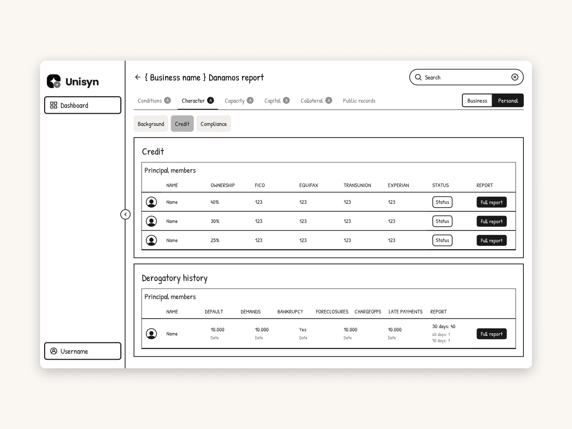
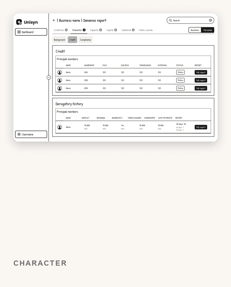
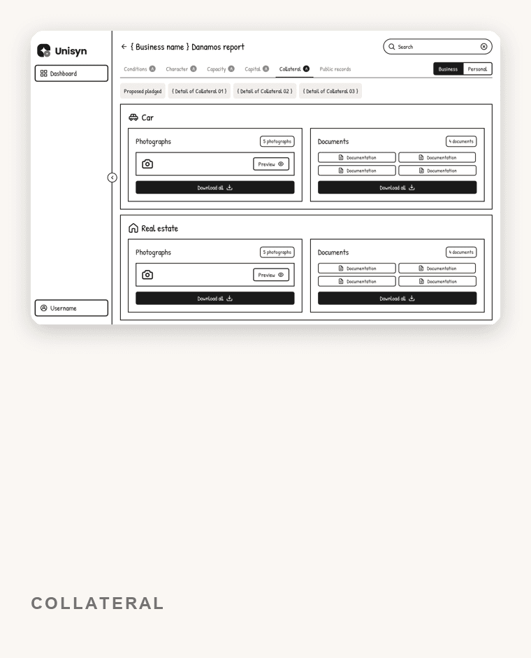
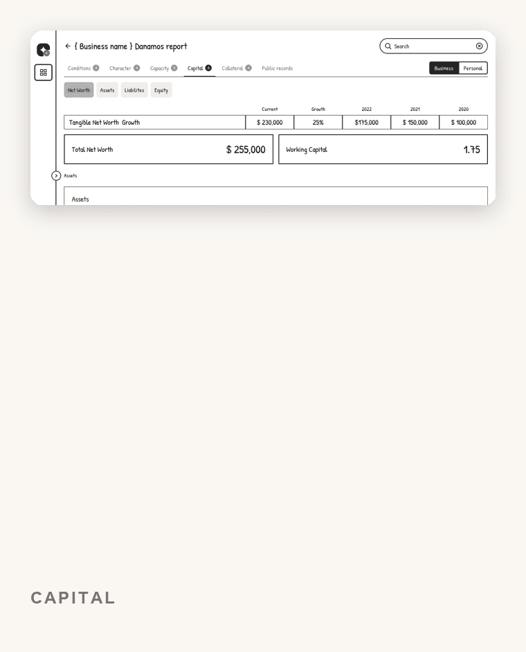
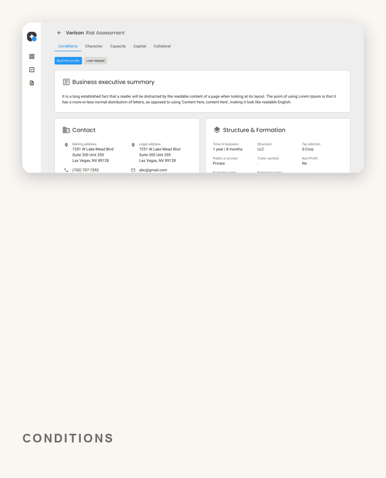
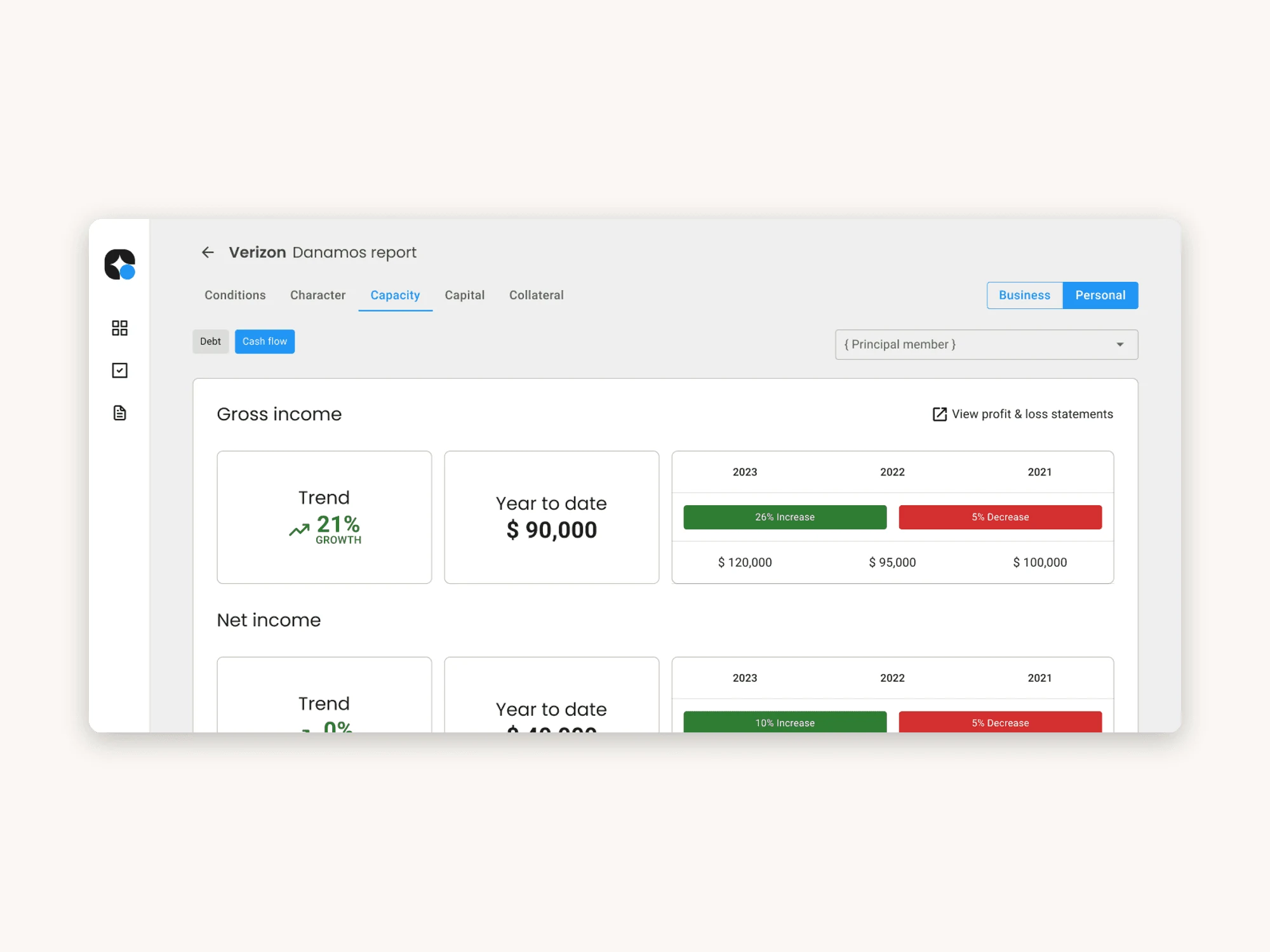
The core problem was reasoning, not decoration. Working from research into lenders’ real pain points, I led the team from low-fidelity wireframes up, mapping the flow and settling navigation before committing to detail. The goal at every step: let a lender see the whole picture and act on it, instead of piecing it together from fragments.
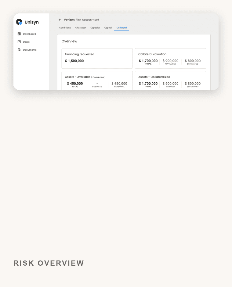
The core fix was reasoning, not decoration: let a lender see the whole picture and act on it.
3. Building on the system, not around it
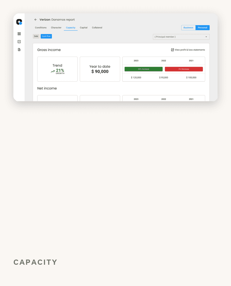
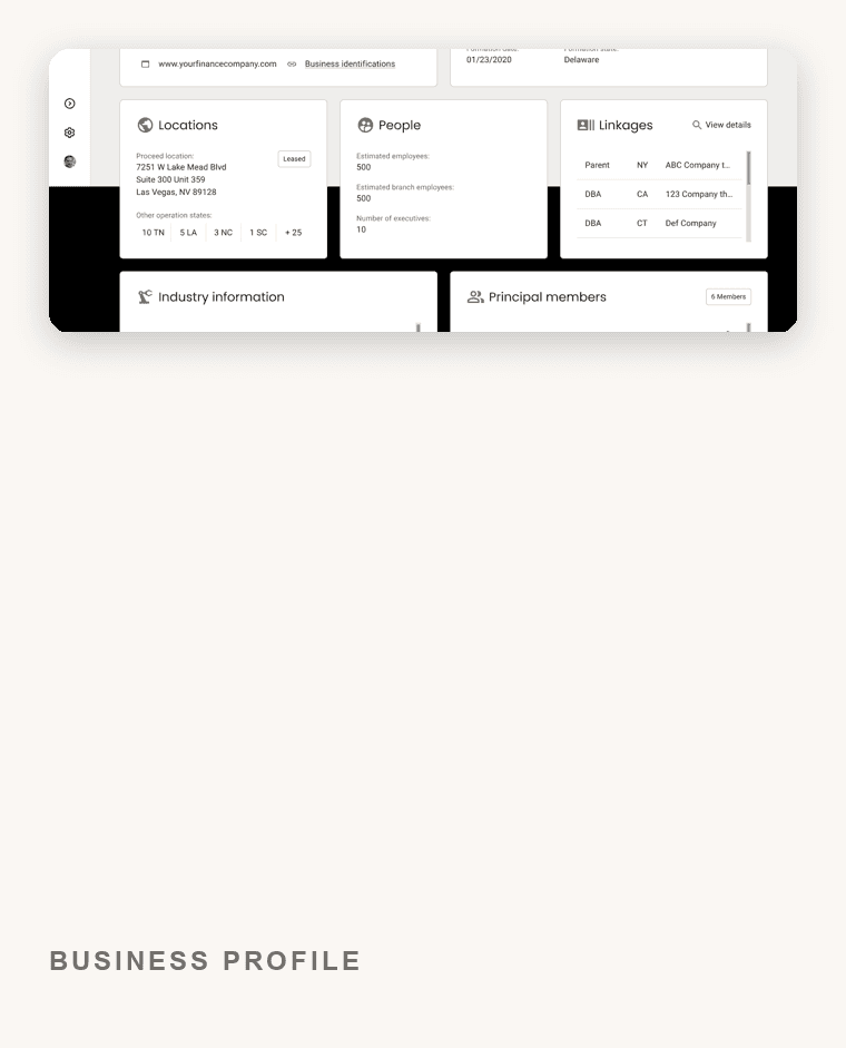
Building on the existing component library was a product decision as much as a design one. It shipped the work faster and gave customer- and operator-facing surfaces one shared language, which is what cut UI inconsistencies across the platform. I wrote detailed specifications so four designers could work to the same standard without drift.
Building on the existing component library shipped the work faster and gave every surface one shared language.
4. De-risking with real prototypes
I had the team build high-fidelity, interactive prototypes in Figma for the flows that mattered most, close enough to the real thing to test and refine with confidence. Prototyping settled questions about the assessment and report flows with something people could actually use, and surfaced problems before they reached engineering.
High-fidelity, interactive prototypes settled the key flows and caught problems before they reached engineering.

Try it yourself
The result
The redesigned platform made a genuinely complex job feel manageable. Lenders spent noticeably less time on risk-assessment tasks and consistently praised how much easier the tool was to use, without giving up any of the rigor or security the work demands.
Lenders spent noticeably less time on risk assessment and praised how much easier the tool was, with no loss of rigor or security.
Impact
Higher task completion and lower user error across document-intensive onboarding and underwriting.
Faster engineering handoff, by turning cross-functional inputs into a prioritized, acceptance-criteria-backed backlog.
Fewer UI inconsistencies across customer- and operator-facing surfaces, through shared product language and interaction patterns.
Mentored a team of four, scaling those patterns across the lending platform.
The lesson I took from Unisyn is a product one. In a high-stakes tool, trust comes from removing doubt: give people one confident view, decide what matters most and build that first, and make security part of the experience instead of a hurdle. Get those right and even a hard decision starts to feel manageable.